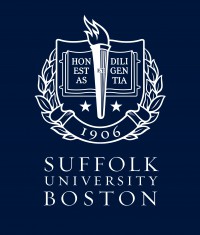
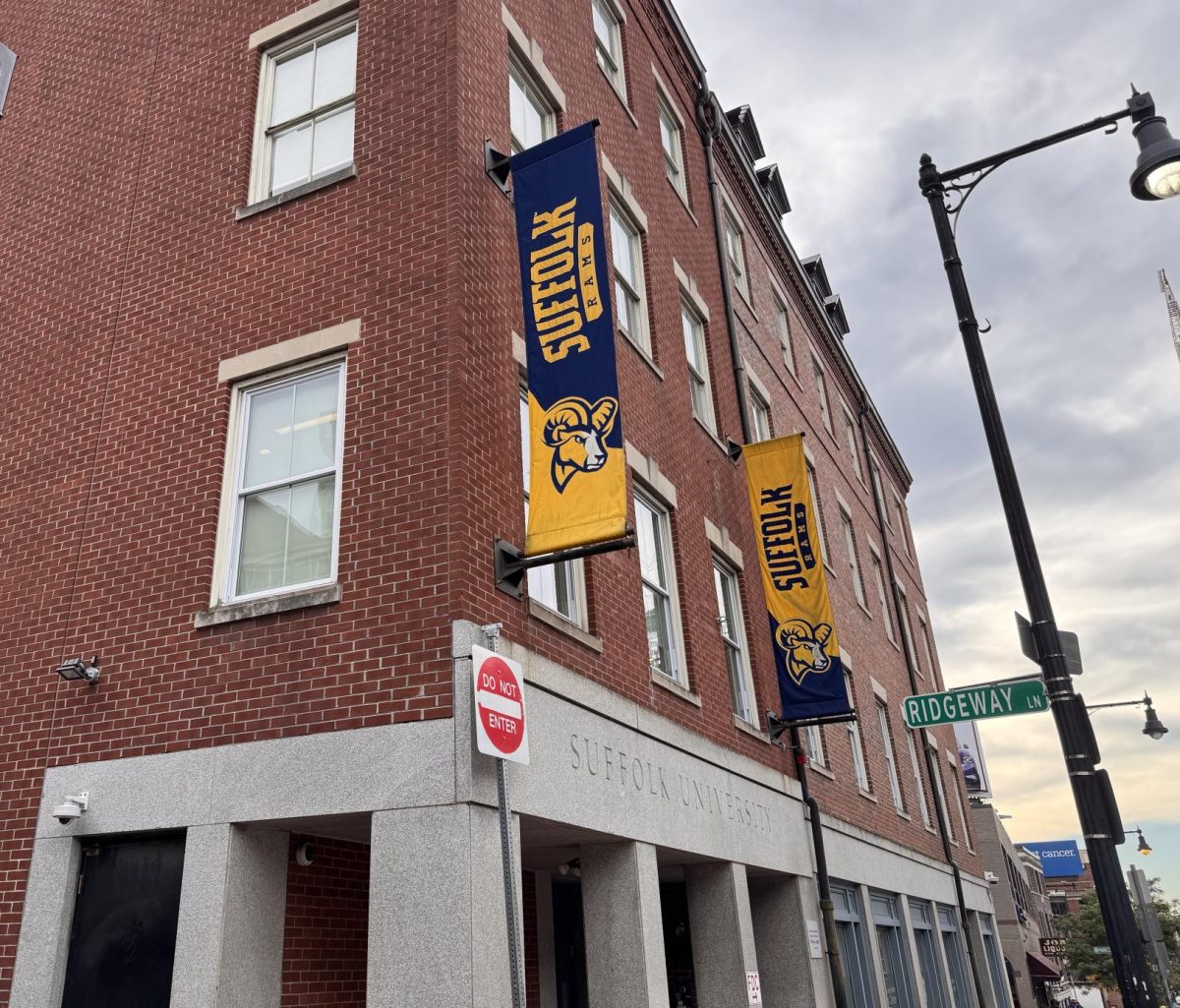
Suffolk has a new face. It’s not a ram or a shield, it’s a coat of arms.
President Norman Smith announced a new coat of arms to act as an alternative logo for the university in an email to staff and faculty last week.
In the email, which was obtained by the Journal, Smith wrote, “What is going on is what I am calling a return to Classic Coke. While there is some affinity to the new stylized upper-and-lower-case design with the modern ‘shield and flame,’ there remains a strong affinity to the gravitas of the classic coat of arms.”
He said the university will use both the new shield and coat of arms, in the same way that Coca-Cola employs the new Coke brand with the classic Coca-Cola brand.
Of the new coat of arms, sophomore Cierra Morson said, “The new logo creates interest and intrigue, while the other one is just ‘blah.’” Junior Shannon Hook said, “The new logo makes me feel like Suffolk is more official, and a high-class school.”
Likewise, junior Samantha Burns thinks, “The old logo makes it look like it’s an online school. They tried to make it appeal to a new audience and it just didn’t work … It’s too boring.”
Senior Graphic Designer at Suffolk University Denise Lang said that the logo was made out-of-house.
In the email, Smith said, “BOSTON has been added prominently in gold within the logo. Whenever we are using the seal/logo beyond Boston and environs, we will be routinely adding BOSTON to make it clear to the rest of the world that we are Suffolk University in Boston … and not, for instance, Suffolk Community College in New York … to name just one such institution often confused with us.”
The change is not one in the university’s name, but including “Boston” in the logo associates the school with the city more strongly.
Smith told staff they can keep their letterhead, business cards, or other logo products and encourages anyone who likes the more modern version to use it.


