

It’s the beginning of the school year and you need a new pair of shoes. At the department store you have hundreds of choices but you select a new pair of Converse, just like you’ve been doing every few years since middle school. What is it that makes you choose one brand over another? Businesses are aware of the overabundance of choice in today’s society, and brands are manufactured to specifically target their audience. You choose a brand because of what it represents and what it does for you. Suffolk University’s Marketing and Communications department has begun the process of creating a more modern, unified, and recognizable brand that students, parents, and faculty can be proud of and identify with.
“This is a whole comprehensive project that looks at the visual brand and also includes the website,” Suffolk’s President McCarthy commented. “It encompasses all the ways in which we communicate. We think it’s very important that we present communication that makes it clear that we’re one university.” It all started with efforts to redesign the Suffolk website. In doing so, they discovered that Suffolk’s various colleges, departments, and offices had all created their own brands. What the university had were hundreds of variations of symbols, layouts, fonts, and color schemes under the same roof and no coherent brand that united Suffolk as one family.
“Every time we had a new logo, somebody had to pay to have it designed or they had to design it themselves,” said McCarthy. “We were spending a lot more than we needed to on something which was, in effect, a very diffuse brand.”
In creating a new brand, the University wanted not only to create unification but also to strengthen the presentation of the individual departments. Suffolk brought in a marketing consultant, Sametz Blackstone Associates, to help them get started.
“This new brand system gives us the tools to build a more unified and dynamic university image,” said Greg Gatlin, Vice President of Marketing and Communications. “That will help us with marketing the university, recruiting, fundraising, communicating to current students, prospective students, alumni, employees, you name it. It’s more than just a logo. It’s a whole system of color, photography, typography, language. It’s really a new way of communicating who we are. The idea is to elevate the university’s brand and bring more people into the conversation.”
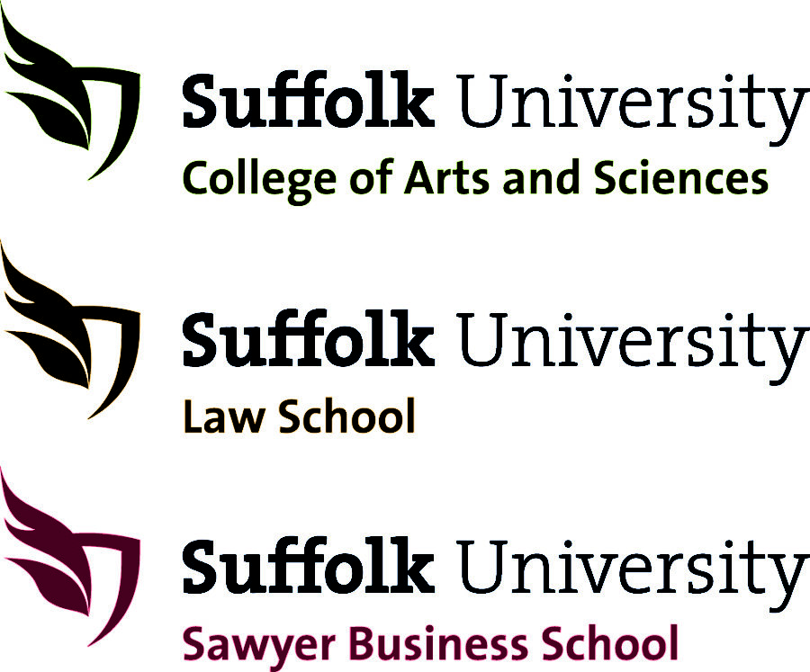
One of the most important pieces of the new brand is the new symbol that represents the university. An excellent and creative way to unite the colleges was to introduce the symbol as an identifier for the whole university, and then to color code it according to the different schools: the Law School is gold, the Business School is red, and the College of Arts and Sciences is green.“I’m not really sure what it is,” said senior Lily Smith when asked to comment on the new symbol. “I liked the building profile very much. Maybe if I did [know what it was] it would help.”
The new flame and shield symbol has a lot more to do with Suffolk’s heritage than the former image of 73 Tremont did.
“We think the new symbol is a more inclusive, more contemporary and a more dynamic image that captures where the University is headed,” said Gatlin. “You can almost feel the motion, emotion and energy in the symbol’s flame. That really feels like where Suffolk is today. We are a university on the move.”
When Gleason Archer, Sr. founded the University in 1906, he designed the Suffolk University seal himself. In the center of the seal is a torch, the original representation of Suffolk “lighting a path.” The new symbol includes a modern artistic rendering of the flame from the torch and adds a contemporary version of the university shield.
“The new logo is a fresh new expression of the flame that is found in the university’s seal, and it represents the highest ideals of Suffolk, lighting a path towards excellence,” said George Comeau, Director of Digital and Interactive Communications at Suffolk University. “I like the feel of motion and the use of light. The shield is a classic symbol for academia and scholarship. Taken together, the flame and shield are a dynamic and positive expression for Suffolk University.”
Other than the new symbol, the brand uses a lot of color, enticing language, and friendly fonts. They did not want it to be boring like the old student information packets were; they wanted something refreshing and relatable. In prototypes for new student packets, it is clear that all of the publications come from the same entity. However, upon closer inspection the colors and images specifically target each audience. While the fonts and some aspects of the layout are similar, sophisticated portraits and deep colors make up the brochure for the Law School while bright colors and fun images are for the College of Arts and Sciences. Again, this unites the brand while strengthening what each college has to offer.
“I like that it’s really simplified,” said junior Colin Barry. “And unlike the old logo, it shows the school colors. It’s showing that we have a bit of a creative side. We’re not just “Hey, we’re Suffolk University.’ We’re something that’s gonna stick out.”
Suffolk University’s brand is about a lot more than having a new symbol, fonts, and color schemes. The administration wants students to choose Suffolk, but they also want to present a brand that tells prospective students why they should want to be here, tells current students what Suffolk can do for them, and tells everyone, including parents and faculty, what kind of community Suffolk University is. There is no quad, there is hardly a campus, but Suffolk is a family. Creating a cohesive brand is the crucial first step for creating a true feeling of community at Suffolk University.


Suffolk University • Sep 27, 2012 at 7:30 pm
“The new flame and shield symbol has a lot more to do with Suffolk’s heritage than the former image of 73 Tremont did” http://t.co/4oD7yj2G
The Suffolk Journal • Sep 25, 2012 at 11:35 am
University re-brands seeking to rejuvenate image: http://t.co/vaRUWGKD @universalhub