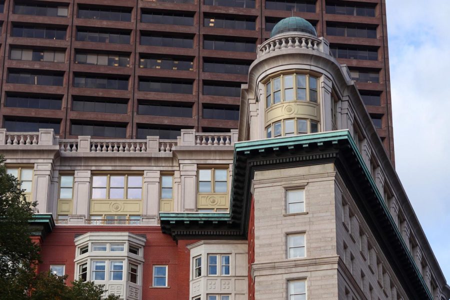
Bathed in fluorescent lights and canary colored walls, Sargent Hall’s Adams Gallery is adorned with the various creations of its newest exhibit, “Do. Did. Done.”
The exhibit showcases the thesis pieces of the New England School of Art and Design masters of Arts in graphics program. From websites and apps to street art, the exhibit encompassed a vast array of graphic design projects from seven of NESAD’s graduate students.
Because of the nature of the pieces, the exhibit featured multiple interactive stations, equipped with desktop computers and iPads. One student, Bethany Ann Hubartt, designed an app for iPhone users titled “Caked.” Hubartt, inspired by her background in cake decorating, created the app in order to help people determine how they are feeling towards a particular issue or problem by matching the user’s attitude to a certain flavor of cake.
By asking questions about your attitude towards a specific topic, the app will then determine your CIF ratio, otherwise known as icing, filling, and cake. The icing is symbolic of the surface of you feeling, the filling represents the deeper parts of your feelings, and the cake represents the very core of your thoughts and emotions.
Another pieces entitled, “Dystopia” by Elizabeth Bond featured various shadow boxes, all filled to the brim with trash. Beer bottles, plastic utensils, milk cartons, and empty pints of Ben & Jerry’s littered each frame, allowing the viewer a detailed look at the inside of a trashcan. However, the aim of the art was not to disgust, but to educate.
“The campaign uses real trash in public places to catch consumers off-guard in their habitual personal spaces,” said Bond. “It displays our excess in a way that brings awareness and engages for change toward more sustainable living.”
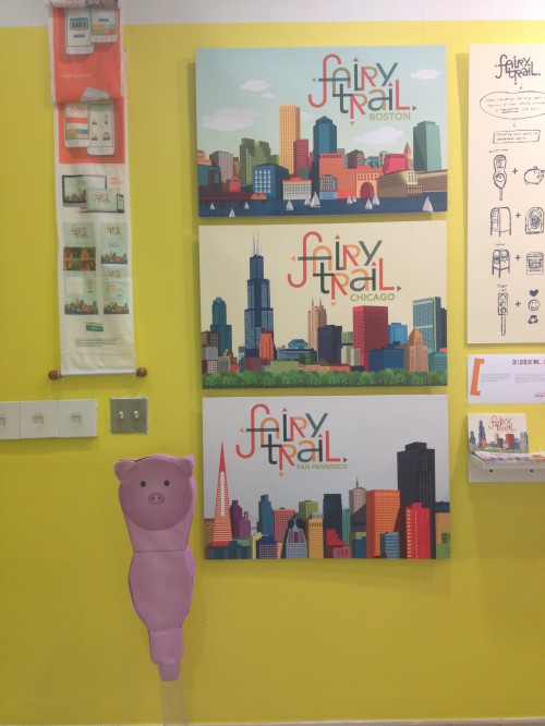
A visually appealing project in the exhibit was “Fairy Trail” by Felita Go. The project was designed around the idea of taking everyday objects in cities and turning them into whimsical representations. Common objects such as parking meters, mailboxes, and traffic lights were decorated to appear as farm animals or even jukeboxes.
Student Shubha Roy took a different approach with her thesis, creating a website that serves as a beginner’s guide for those pursuing graphic design titled, “guid.ed”. The idea behind the website is to, “reinforce the craft aspect of graphic design among designers and those interested in becoming designers” said Roy.
A unique feature of the gallery was a flat screen television mounted on the far wall. While exploring the exhibit, visitors can watch a short interview with each of the designers, learning more about their art and influences.
Admission to the Adam’s Gallery is free and is open to the public from 9 a.m. to 7 p.m. daily.


