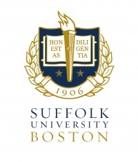
President Norman Smith has branded Suffolk with a classy new coat of arms, starring sharp fonts and regal colors.
This new coat of arms is an alternative logo, he said in an email to employees, and will give a clear message about the university to people outside the Boston region.
President Smith asked the right people to make the new coat of arms. Its simple design is visually appealing and it displays the university’s Latin motto proudly.

Two years ago Suffolk unveiled its current logo, what some describe as a shield with flames bursting off it. And quite frankly, no one likes it.
The logo seems cartoonish and not as distinguished as its predecessor, the outline of the top of the Rosalie K. Stahl building at 73 Tremont.
Having an elegant alternative is a great asset for the university. The new coat of arms even gives a taste of the old logo.
But will a classic coat of arms actually make a huge difference in “getting Suffolk on the radar” or recruiting more students? Will prospective students care more to look into Suffolk University after seeing it?
It would be smart for the university to poll incoming students next September and see if the new, sophisticated shield helped draw their eye to our school.
Even if the coat of arms doesn’t make a huge difference in attracting new students, it is great to see the university with two logos. Having a classic coat of arms can only be positive for Suffolk.


